Karan Athrey

Data/Machine Learning Professional Portfolio
My portfolio demonstrates strong technical skills in data analytics and machine learning across diverse domains, from sports analytics to economic research. The projects showcase expertise in data processing, predictive modeling, and visualization using tools like Python, SQL, Tableau, and Power BI.
View My LinkedIn Profile
Portfolio
NFL Big Data Bowl 2025 - ML Dual Prediction Model
Overview
This project aims to predict whether an NFL play will be a run or pass and estimate the yards gained. Using machine learning techniques on NFL game data, we seek to enhance decision-making in play strategy and provide actionable insights for teams. The project addresses two key questions:
- Will the next play be a run or a pass?
- How many yards will the play gain?
Data Overview and Cleaning
The dataset combines NFL play-by-play records, player tracking data, and Pro Football Focus (PFF) analytics. Key features include:
- Game context: quarter, down, yardsToGo
- Team information: possessionTeam, defensiveTeam
- Offensive setup: offenseFormation, receiverAlignment
- Player movement: x, y coordinates, speed, acceleration
- Play characteristics: playClockAtSnap, playAction, dropbackType
- Target variables: is_pass (binary), yardsGained (numeric)
Data cleaning steps:
- Merged multiple CSV files using primary keys
- Handled missing values through imputation or removal
- Encoded categorical variables for machine learning models
- Consolidated relevant features into a single dataset
Feature Engineering and Importance
Key engineered features:
- down_distance: Combines down and yards to go
- score_differential: Difference between team scores
- pass_situation_tendency: Likelihood of passing based on yardage and down
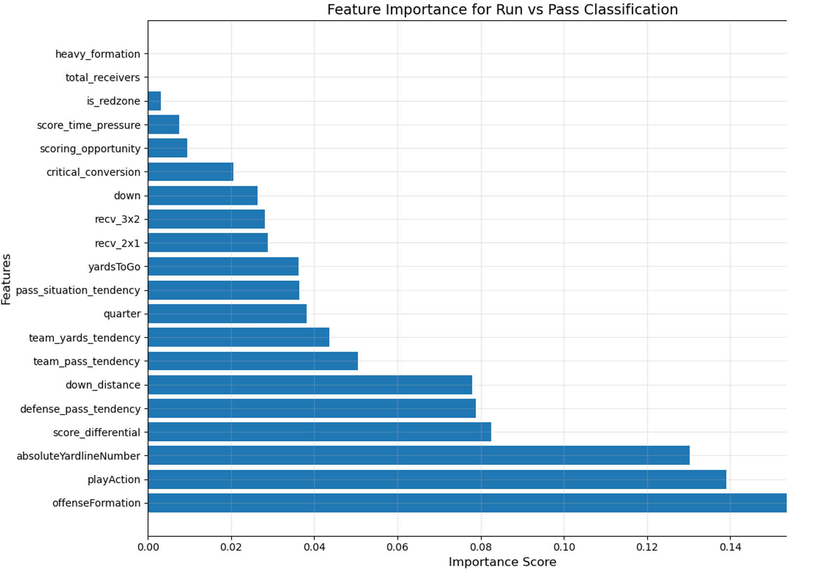
Top features by importance:
- offenseFormation
- playAction
- down_distance
These features significantly influence play type predictions and align with football strategy intuition.
Analysis and Findings
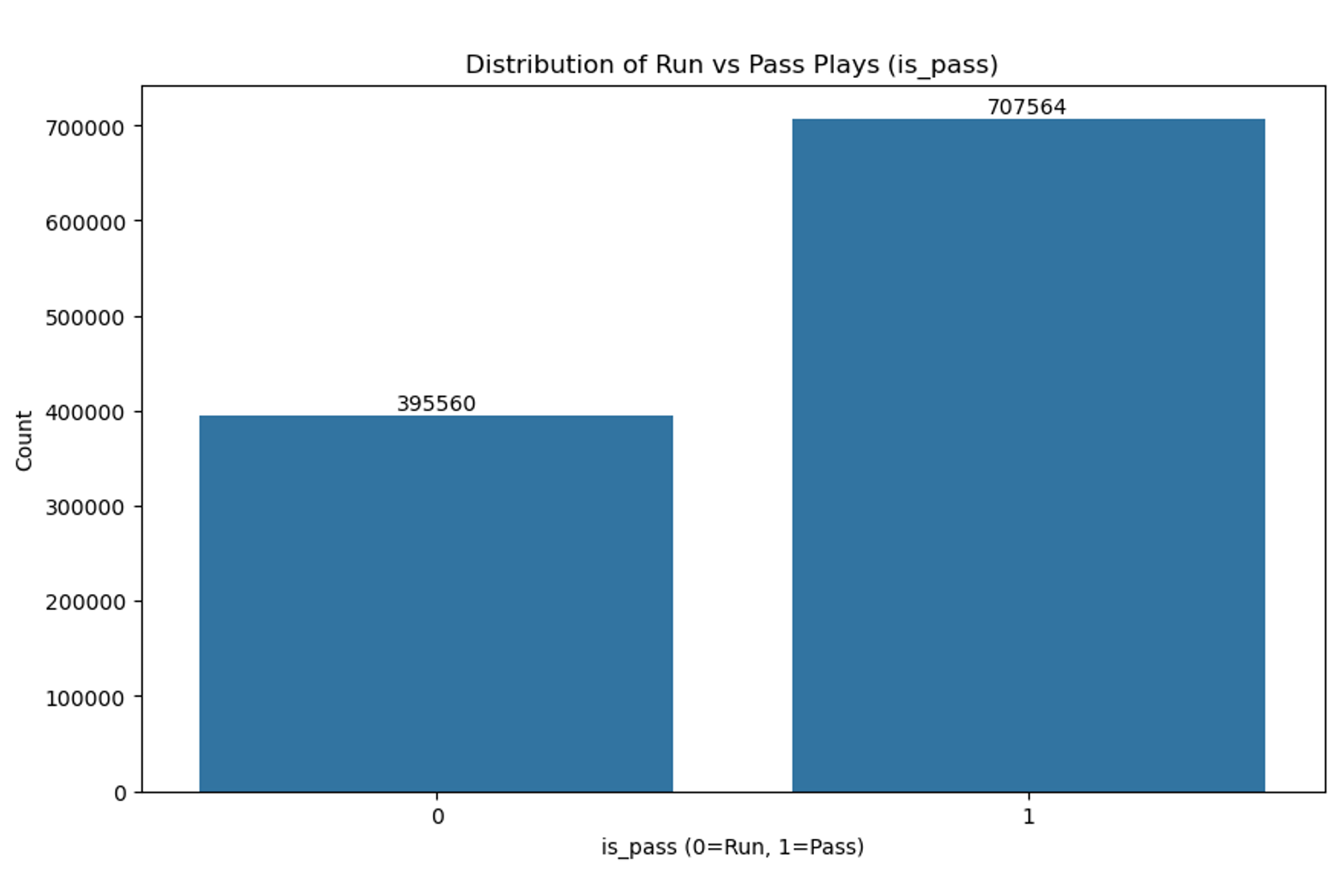
- Pass plays (65%) outnumber run plays (35%), indicating a potential bias towards passing in modern NFL.
- Passing tendency increases on later downs, peaking at 82% on 3rd down.
- Offensive formations strongly correlate with play type (e.g., “Empty” for passing, “I_FORM” for running).
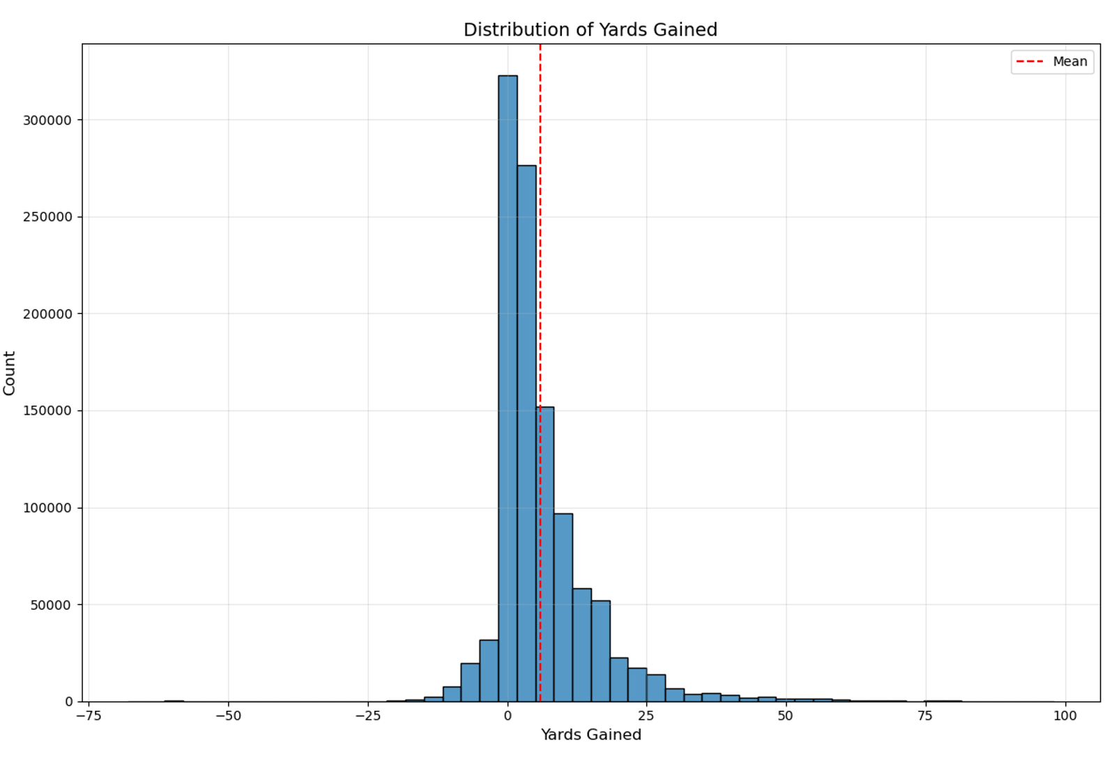
- Yards gained distribution is right-skewed, with most plays gaining 0-10 yards.
Model Overview & Performance
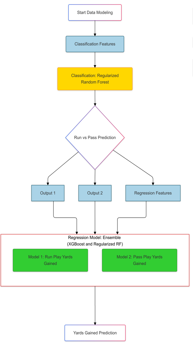
Two-stage modeling approach:
- Classification Stage (Regularized Random Forest)
- Input: Pre-play features
- Output: Run/Pass predictions and probabilities
- Performance:
- AUC-ROC: 0.94
- F1-scores: Run (0.79), Pass (0.90)
- Regression Stage (XGBoost)
- Separate models for run and pass plays
- Input: Classification outputs + regression features
- Performance:
- Run Plays: R² = 0.4504, RMSE = 5.04 yards
- Pass Plays: R² = 0.2894, RMSE = 7.99 yards
(Tools used: Python - pandas, scikit-learn and matplotlib)
Conclusion
The project demonstrates the potential of machine learning in NFL play prediction. Key insights include:
- Run plays are more predictable than pass plays
- Offensive formation is the strongest predictor of play type
- Model performance is stronger for shorter yardage situations
These findings can enhance in-game decision-making, improve player training, and provide teams with a competitive edge. Future improvements could focus on addressing the variability in pass plays and refining models for edge cases.
Clustering Analysis
Overview
This project focuses on image compression using clustering techniques. The task involved compressing a given image by experimenting with various combinations of clusters (\(k\)) and window sizes (\(c \times c\)). The clustering methods applied were k-means clustering and hierarchical (agglomerative) clustering. The combinations tested were:
- k in {4, 8, 16}
- c in {20, 40, 60}
The evaluation metrics used included reconstruction error for k-means clustering and both reconstruction error and compression rate for agglomerative clustering. The goal was to identify the optimal combination of \(k\) and \(c\) for effective image compression.
Analysis and Findings
Original Image:

K-Means Clustering Results:
 The image compression with k=16 and c=20 with K-means clustering yielded the lowest reconstruction error, which can be attributed to several key factors:
Window Size (c=20) The smaller window size of 20x20 pixels provides better preservation of local details:
- Captures fine-grained features like the reflection in the water
- Maintains the distinct edges between buildings and trees
- Preserves the textural details in the foliage and architectural elements
Number of Clusters (k=16) The higher number of clusters (k=16) contributes to better color representation:
- Allows for more diverse color palette representation
- Captures subtle color variations in the sky and vegetation
- Maintains good distinction between different shades of green in the trees
- Preserves the contrast between the building structures and natural elements
(Tools used: Python - scikit-learn and matplotlib)
Visual Quality Assessment The compressed image demonstrates strong quality retention:
- Clear definition of the tall building’s structure against the sky
- Well-preserved water reflections
- Minimal blockiness or artifacts in the compressed output
- Good preservation of the overall scene composition and depth
The reconstruction error of approximately 18340827483.29 indicates that while compression is present, the image maintains significant visual fidelity to the original, particularly in preserving both structural and natural elements of the urban landscape.
Agglomerative Clustering Results:
The analysis of agglomerative clustering focuses on optimizing both compression rate and reconstruction error. The compression rate indicates how effectively the image data is reduced while maintaining visual quality.
Top Performing Combinations
| Parameters | Reconstruction Error | Compression Rate |
|---|---|---|
| k=16, c=20 | 23.86 × 10⁹ | 11.45 |
| k=16, c=40 | 25.37 × 10⁹ | 14.83 |

Optimal Configuration The combination of k=16 and c=20 emerges as the superior choice for several reasons:
- Achieves the lowest reconstruction error (23.86 × 10⁹)
- Maintains a reasonable compression rate of 11.45
- Provides better balance between data reduction and image quality
- Shows only minimal compression loss compared to the k=16, c=40 configuration
While the k=16, c=40 combination offers a slightly higher compression rate (14.83), the increased reconstruction error makes it a less optimal choice. The selected parameters (k=16, c=20) demonstrate that smaller window sizes can achieve better error rates while maintaining acceptable compression levels.
Comparison of Clustering Methods
Performance Metrics
| Method | Parameters | Reconstruction Error | Compression Rate |
|---|---|---|---|
| K-means | k=16, c=20 | 18.34 × 10⁹ | N/A |
| Agglomerative | k=16, c=20 | 23.86 × 10⁹ | 11.45 |
Key Observations
- K-means clustering achieved a lower reconstruction error, demonstrating better image quality preservation
- Agglomerative clustering provides explicit compression rate metrics, offering a clear measure of data reduction
- Both methods perform best with the same parameter combination (k=16, c=20), suggesting these values are optimal for this particular image
- Visual quality remains high in both methods, preserving key features like the building structure, water reflections, and foliage details
Conclusion
Through this clustering analysis project, I identified that the optimal combination of \(k\) and \(c\) depends on the trade-off between reconstruction error and compression rate. K-means clustering provided [insert insight], while agglomerative clustering excelled in [insert insight]. These findings highlight the strengths and limitations of each method for image compression tasks.
Global Economic Analysis
Overview
This project analyzes economic indicators across six geographically diverse countries, focusing on GDP growth patterns and unemployment trends from 1900 to 2015. The analysis combines data processing using SQL with interactive visualization in Tableau to uncover relationships between GDP growth, GDP per capita, and unemployment rates.
Data Overview
The dataset comes from Gapminder’s Systema Globalis collection, structured in the DDFcsv format, containing detailed economic indicators for countries worldwide. The key components include:
Economic Indicators:
- GDP Total Growth
- GDP Per Capita Growth
- Unemployment Rates (by gender and age groups)
Data Processing Steps:
- Created a normalized database schema with three main tables:
- unemployment_rates (tracking unemployment by age group and gender)
- gdp_growth_data (containing both total and per capita GDP growth)
- population_data (urban population statistics)
(Tools used: MySQL)
Analysis and Findings
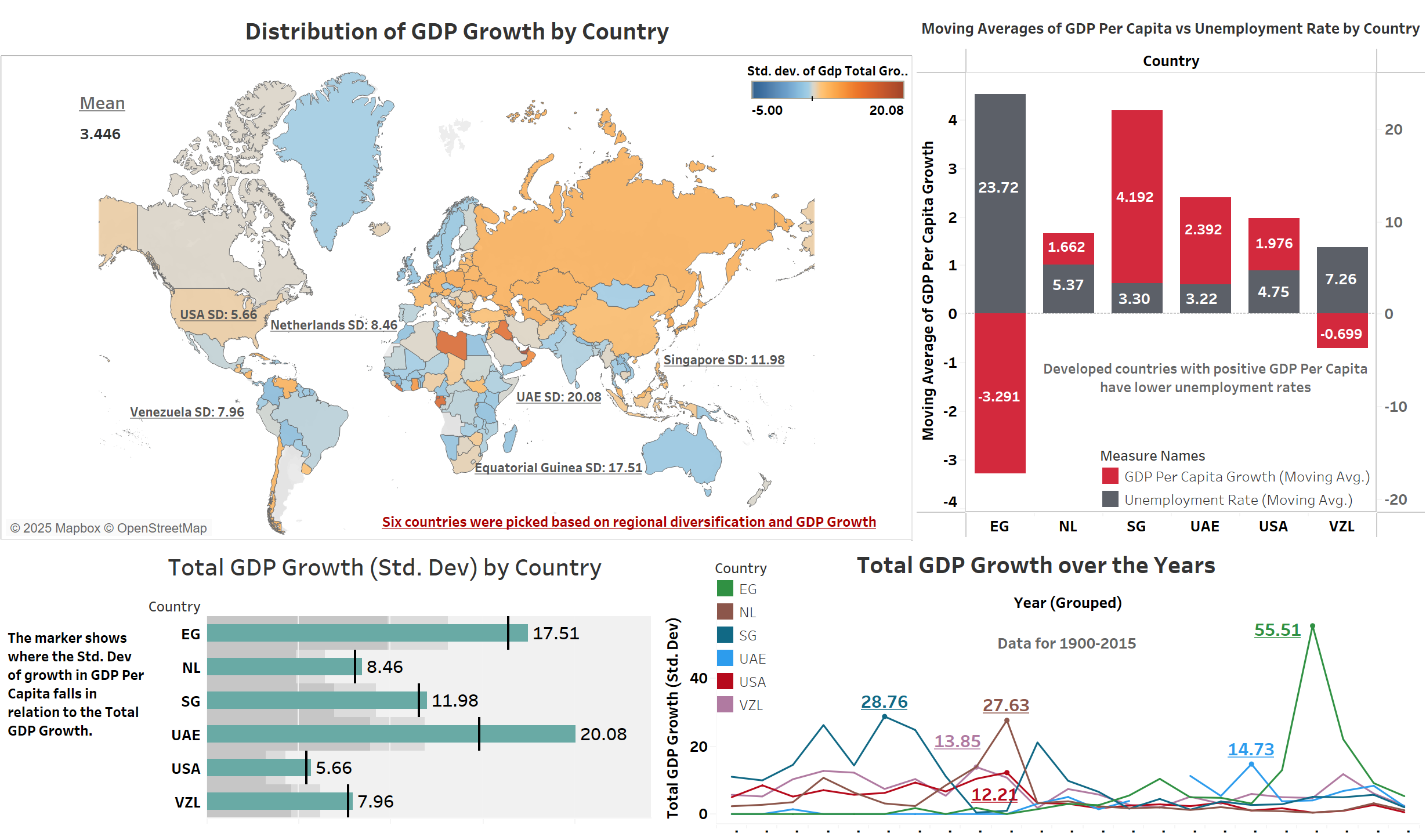
The analysis reveals several key patterns in economic development across the selected countries:
GDP Growth Volatility:
- UAE shows the highest standard deviation (20.08) in GDP growth, indicating significant economic volatility
- USA demonstrates the most stable growth pattern with the lowest standard deviation (5.66)
- Singapore maintains moderate volatility (11.98) despite rapid development
Unemployment and GDP Relationship:
- Developed nations show lower unemployment rates with stable GDP per capita growth
- Emerging economies exhibit higher volatility in both metrics
- The Netherlands demonstrates the most balanced relationship between unemployment (5.37%) and GDP per capita growth (1.662%)
Dashboard Visualization
(Tools used: Tableau)
Key Dashboard Insights:
- Geographic distribution shows regional patterns in GDP growth stability
- Moving averages reveal long-term trends in economic development
- Clear correlation between unemployment rates and GDP per capita growth across regions
Conclusion
The analysis demonstrates that developed countries tend to maintain more stable economic growth patterns with lower unemployment rates. The UAE and Singapore show characteristics of rapidly developing economies with higher growth volatility, while the USA and Netherlands represent mature economies with stable growth patterns. The data suggests that economic stability and unemployment rates are closely linked to a country’s development stage, with more developed nations showing more resilient economic indicators.
India-Australia Test Series 20/21 Pitch Map Analysis - Project 1
Overview
This project is based on the sport of cricket. The aim of this project is to analyse and compare the pitching zones of the top bowlers in the India-Australia test series in 2020/21. This is accomplished by visualising the ball by ball data which can be obtained from ESPNcricinfo’s scorecard commentary.
Data Collection and Overview
The source of the data was the scorecard available on ESPNcricinfo. The ball by ball data from every innings of the four matches was web scraped for this project. The raw dataset obtained were stored as structured data in a CSV format and have the following attributes -
- 'ball' - The ball number identifier for a ball bowled in an innings.
- 'bowler_batsman' - Player information on which bowler bowled to which batsman.
- 'result' - The result of a bowled ball.
- 'commentary' - The detailed commentary for a ball bowled.
(Tools used: Python - pandas and BeautifulSoup)
Data Cleaning and Transformation:
The raw data scraped had to be structured and transformed to be made readily available for data analysis. The data in its raw form does not allow for required analysis and therefore different transformation techniques were applied to make the dataset viable.
Firstly, two new attributes were created using the 'commentary' column. Using word filters, the python code searches for keywords in the 'commentary' field and determines the line and length for a bowled ball. The line and length are key attributes for a pitch map analysis as they define the position of ball landing on the pitch.
The different datasets acquired for each innings in the four matches were merged into one excel file so that the entire series can be analysed under a single dataset. This excel dataset can be viewed on my Kaggle Profile. The dataset was further cleaned for consistency. The 'bowler_batsman' was split into two columns of 'bowler' and 'batsman' and the data tpyes of each column were corrected.
(Tools used: Python - pandas, Power BI - Power Query Editor)
Analysis and Findings
A pitch map was achieved by the use of a scatter plot. The line and length represent the x and the axis of the scatterplot respectively. This creates a simplified pitch map to represent the point at where the ball pitched.
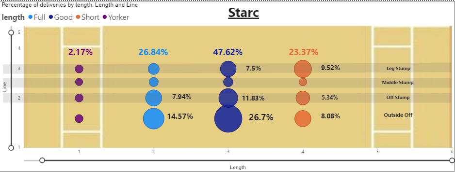
- The Australian bowler Mitchell Starc bowled 47.62% of 'Good' Length deliveries with 26.7% of those balls being 'Outside Off'.
- Starc also favoured the 'outside off' a lot in terms of line with approximately 50% of deliveries in that line.
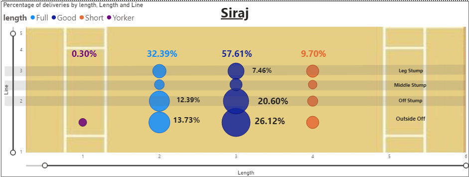
- The Indian bowler Mohammad Siraj was more condensed in his bowling with 57.61% of 'Good' length balls and 46.72% of balls bowled on the 'Off Stump' and 'Outside Off' combined.
- Siraj also bowled significantly more on the 'Good' length and on 'Off Stump' compared to Starc with 20.60% of balls pitching in that region.
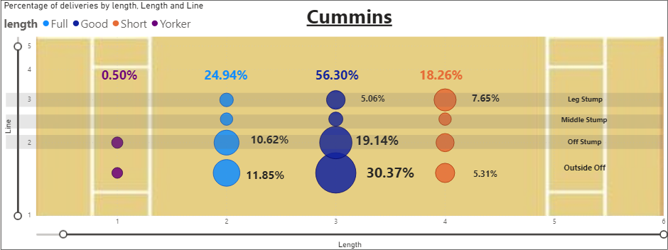
- Australian bowler Pat Cummins was similar to Siraj where 19.14% of his balls were pitched on 'Off Stump'on 'Good' length and 56.30% ball pitched on the 'Good' length.
- Cummins also pitched the most balls on the 'Good' length and 'Outside Off' line with 30.37% of balls pitched in that region.
(Tools used: Power BI - Visualisations)
Conclusion
The most vital conclusion is how the worst pace bowler in the series, Starc with 11 wkts @40.72 average didn’t bowl enough good length aiming at the off stump area. Compare that to Cummins or Siraj who were much more disciplined in that aspect. Both Siraj’s and Cummins’ success can be related to their higher pitches in that area.
Cricket Batsman’s Score Predictor - Project 2
Overview
This project aims to create a model to predict a Chris Gayle’s IPL score using Bayesian Gaussian Inference. The ‘deliveries.csv’ dataset is taken from Kaggle and it contains ball by ball data for all IPL matches from 2008 to 2016.
Data Overview and Cleaning:
This dataset has 150460 records for every single ball bowled in all the nine seasons. Experiments across Bayesian Inference will be performed over this dataset to make satisfactory models which will help make an inference or prediction of a specific event.
The dataset needed to be filtered for the batsman “Chris Gayle”. The key columns from this dataset required for this project are:
- ‘match_id’: Shows the match number.
- ‘over’: Over of the match.
- ‘ball’: The ball number of the over.
- ‘batsman_runs’: The runs scored in a particular ball.
Moreover, the ball by ball data is grouped into another dataset which groups the batsman’s runs by matches. This dataset ‘gayle_runs’ was used to build the model.
(Tools used: Python - pandas)
Probability Plotting
Using the column ‘batsman_runs’, the probability density can be plotted for the runs Chris Gayle scores in a single match or a single ball using both ‘gayle_runs’ and ‘deliveries.csv’. The Kernel Density Estimation (KDE) chart was used to plot the probabilities as the KDE plot offers a better and robust alternative to the probability density plot (PDP) as it aggregates multiple normal distributions to estimate data frequency and plot the probability density.
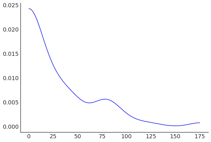
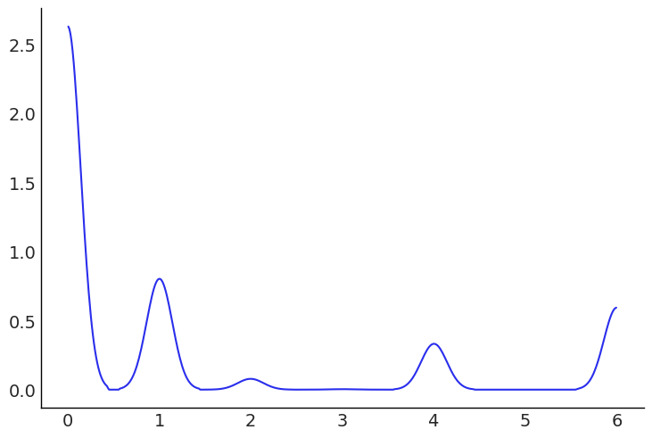
We can get a summary of the probability density of match runs with the help of this graph. The plotted graph shows the highest density for 0-25 runs which does indicate scores to be more common between 0 and 25 in a match. Another observation is the normal like distribution around 75.
This graph plots the probability density for runs on a single ball. The graph shows how the batsman hitting a 6 is more likely than a 4.
(Tools used: Python - pandas and arviz)
Model Description
The parameters in this model are as follows:
- Mean(μ): Prior for mean of the runs defined as a range.
- Standard Deviation(σ): A half normal distribution for runs.
- Function(y): The likelihood for how many runs the batsman will score.
(Tools used: Python - pymc3 and arviz)
Results
Four models were created under different sampling parameters to ensure high efficiency for the model. Each model was tested with Gelman Rubin tests and the most efficient model was used for the project.
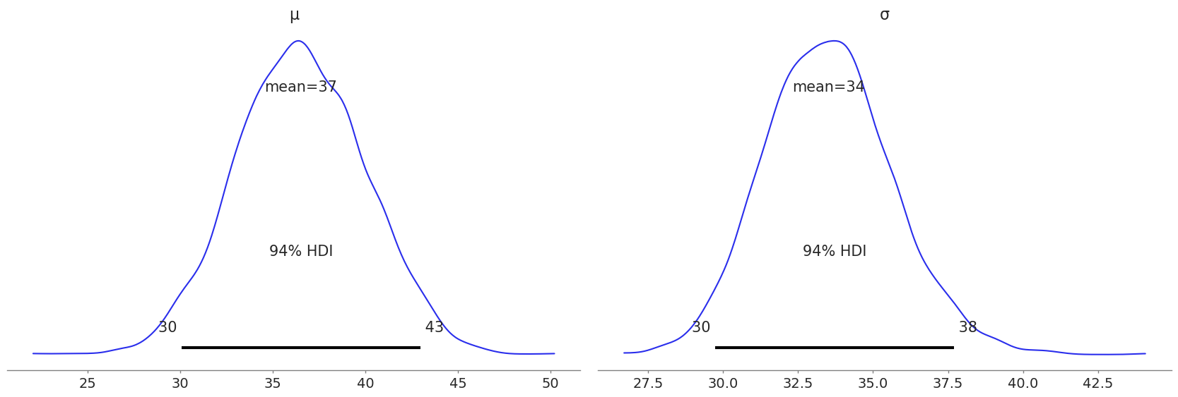
Since this is a type of Bayesian inference, we get the entire distribution of values instead of a single value. Observing the plot, we can interpret that Chris Gayle has a 94% chance of scoring between 30 and 43.
Another way to validate our model and check for a more specific prediction is using the Posterior Predictive Checks (PPCs). A posterior predictive check uses the observed data distribution and the newfound posterior distribution to make valuable predictions.
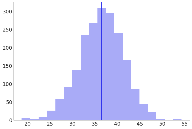
The histogram shows the mean distribution of the posterior predictive. A line is plotted on the inferred mean, which shows that Chris Gayle is predicted to score around 37 runs.
(Tools used: Python - pymc3 and arviz)